

Radhesh started speaking. Hello everyone,
this is my very first blog ,which is about-
The creation and End-To-End process description of project "Video_Games Sales Analysis".
- At first i had collected the necessory data for analysis purpose from :- .
- After Collecting the entire datasets ,i setuped my conda environment for further processing.
- then i opened my jupyter notebook and imports necessory libraries for analysis
import numpy as np
import pandas as pd
import matplotlib.pyplot as plt
import seaborn as sns
PermalinkPandas:-
It is the library for for data manipulation and analysis.
PermalinkNumpy:-
It is the library for adding support for large, multi-dimensional arrays and matrices, along with a large collection of high-level mathematical functions to operate on these arrays.
PermalinkMatplotlib:-
Matplotlib is a plotting library for the Python programming language and its numerical mathematics extension NumPy.
PermalinkSeaborn:-
Seaborn is a Python data visualization library based on matplotlib. It provides a high-level interface for drawing attractive and informative statistical graphics.
PermalinkNow,Loading the DataSet.
- After importing the necessory libraries i had load the Dataset by using command:"pd.read_csv"[csv because my dataset is in the form of csv (comma seperated value)].
raw_data=pd.read_csv('C:/Users/Lenovo/Desktop/projects/video_game_sales_forcasting/vgsales.csv')
raw_data.head(20)
data=raw_data.copy() #To creating the checkpoint
- Data will look like:-
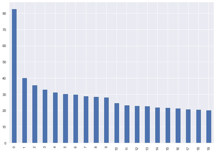
- after loading the data i plotted the graph of "Global Sales":-
data.Global_Sales.head(20).plot(kind='bar');
PermalinkDAY-2
Hello Everyone, Today i was running the more analysis to reach the conclusion
- Checking for Year V/S Global_Sales V/S Genre:
fig,(ax1,ax2)=plt.subplots(2,1)
ax1=ax1.scatter(data['Year'][:1000],data['Global_Sales'][:1000])

ax2=ax2.bar(data['Genre'][:1000],data['Global_Sales'][:1000])
OUTPUT IS:
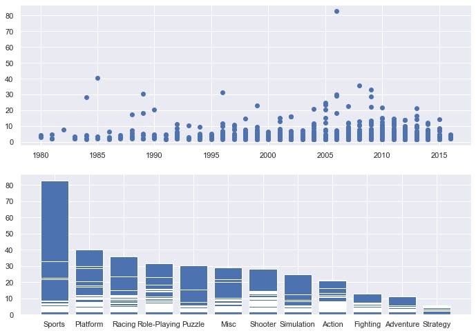
Hmmm... there might be some null values are present in the dataset,But No Worries! :)
- Checking For Null Values present in my dataset
data.isna().sum()
OUTPUT IS:-
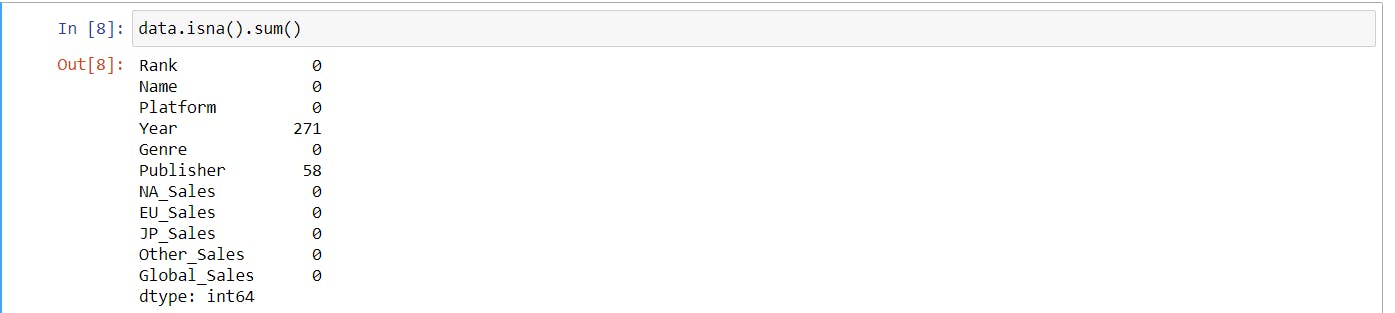
After performing this, i had to filled these null Values. So,i performed the following operation:
- To fill the Year i took the median ,because median is more robust in this case than mean
data['Year']=data['Year'].fillna(data['Year'].median())
- For filling the Publisher First i choosed the value which has maximum occurence, to do this:
data.Publisher.value_counts()
output is:
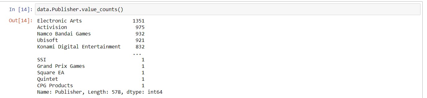
After seeing this you can easily conclude that the EA Games have more occurence than others. so, fill the Null Values With EA Games :0
data['Publisher']=data['Publisher'].fillna('Electronic Arts')
- Now,visualizing the Relation between Global Sales and Names
x1= data.groupby("Name").Global_Sales.sum().sort_values(ascending= False).head(30)
plt.figure(figsize= (7,10))
sns.set_style("whitegrid")
ax= sns.barplot(x1.values,x1.index)
ax.set_xlabel("global sales(in million)");
OutPut:
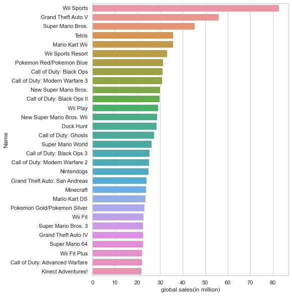
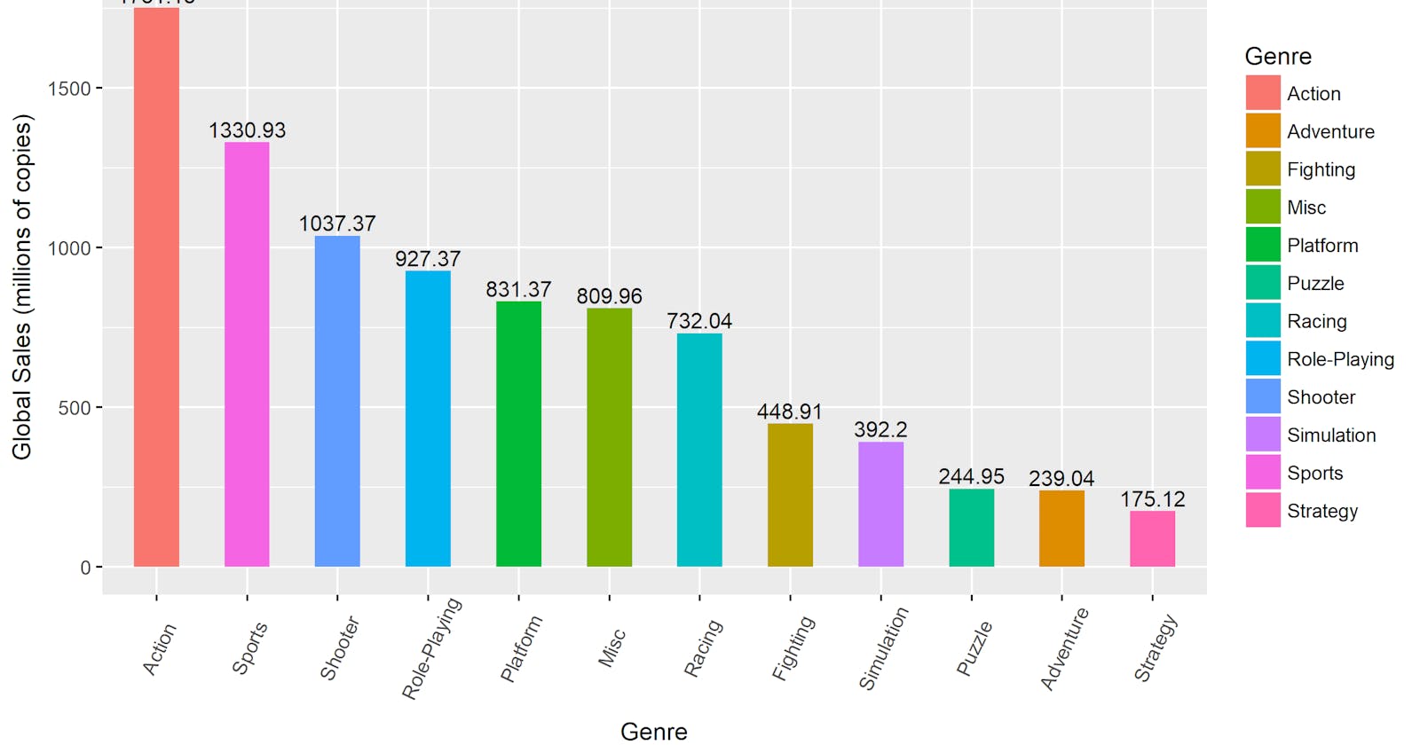
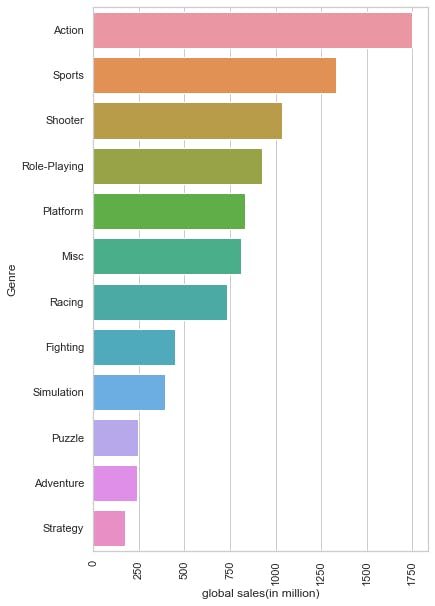
- By seeing this we can conclude that in the first 30 observations the Wii Sport is the game with highest selling. But, Let's check for Genre ;
x2=data.groupby("Genre").Global_Sales.sum().sort_values(ascending=False).head(30)
plt.figure(figsize= (6,10))
sns.set_style("whitegrid")
ax= sns.barplot(x2.values,x2.index)
ax.set_xlabel("global sales(in million)")
plt.xticks(rotation=90);
OUTPUT:
data['Name'].value_counts
So,i concluded that Most popular Genre is Action and most popular Game is Wii Sport
reason of this variance is due to the Lack of availability of Action Games as concluded from above graphs.
PermalinkDAY-3
- Checking for Correlation To extracting the most relavant features
co_rel=data.corr()
top_feature=co_rel.index
plt.figure(figsize=(10,10))
sns.heatmap(data[top_feature].corr(),annot=True,linewidths=.5)

plt.show()
Output :
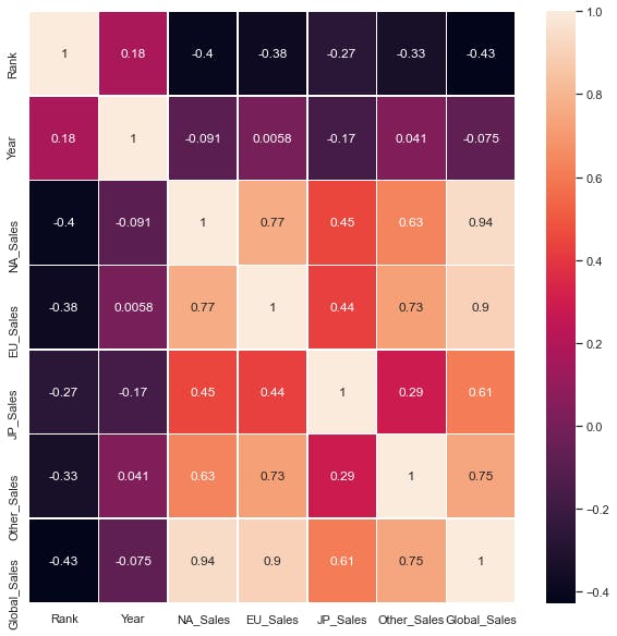
From above heatmap i concluded that the most relavant features for predicting Global Sales are:
- EU Sales
- NA Sales
- JP Sales
- Other Sales
Now,creating X and Y variables
lables_to_include=['NA_Sales','EU_Sales','JP_Sales','Other_Sales']
y=data['Global_Sales']
x=data[lables_to_include]
- After creating the x and y variable i splitted the these into train and test datasets:
from sklearn.model_selection import train_test_split
X_train,X_test,y_train,y_test=train_test_split(x,y,test_size=0.2,random_state=42)
- checking the shape of the datasets
X_train.shape,y_train.shape
output: ((13278, 4), (13278,))
PermalinkNow,Performing Regression
first importing regression models
then fit the Training dataset into model
from sklearn.linear_model import LinearRegression
reg=LinearRegression()
reg.fit(X_train,y_train)
after fitting the model i made the predictions on test dataset with help of trained model:
y_pred=reg.predict(X_test)
y_pred
Output: array([0.15034737, 0.41031654, 0.02037618, ..., 0.02037796, 0.10036296, 0.10036249])
- Checking for r2 score and RMS error value:
from sklearn.metrics import r2_score,mean_squared_error
r2_score_pred=r2_score(y_test,y_pred)
rms_value=mean_squared_error(y_test,y_pred)
print('R2 score is:',r2_score_pred)
print('mean_squared_error:',rms_value)
output: R2 score is: 0.9999934776126175, mean_squared_error: 2.7402923389188296e-05
By observing above ,i concluded that the accuracy is 99% with 0 RMS error that's Great :)
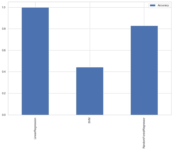
Now,trying other models, For doing this
import models and creat model dictionary
from sklearn.ensemble import RandomForestRegressor
from sklearn.svm import SVR
model_list={"LinearRegression":LinearRegression(),
             "SVM":SVR(),
           "RandomForestRegressor":RandomForestRegressor()
           }
- Now ,by using loops itrate over dictionary.
result={}


for name,model in model_list.items():
    model.fit(X_train,y_train)
    result[name]=model.score(X_test,y_test)

result
Output:
{'LinearRegression': 0.9999934776126175, 'SVM': 0.4420619363075434, 'RandomForestRegressor': 0.8295065016886412}
- Visualizing the accuracy of our models for easy interpretation
result_df=pd.DataFrame(result.values(),result.keys(),
                      columns=['Accuracy'])
result_df.plot.bar();
output:
So,this is the End of my very first blog i hope it will be useful for you , so please do like and follow my blog for future updates because i will be back soon with new project. Till then Thank You